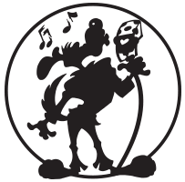
Here are the full pencils from my new convention banner. In the end I removed the ricochet flashes on the advice of others.

BONUS~
Here are two unused versions of the banner.
- The first was a bit more action oriented, but keep in mind two things—
A) The Baroness wears all black.
B) From a distance, her figure would just end up reading as a blob!
2. This one allowed for the figure to read better from a distance, but I felt her posture was a bit too stiff.
See~ art is hard, time consuming, and frustrating! I went thru all this so people could know… where I was sitting. Think about that.


